Wednesday, March 30, 2011 at 2:45 PM
Webmaster Level: Intermediate to AdvancedHere’s a trending User-Agent detection misstep we hope to help you prevent: While it seems completely reasonable to key off the string “android” in the User-Agent and then redirect users to your mobile version, there’s a small catch... Android tablets were just released! Similar to mobile, the User-Agent on Android tablets also contains “android,” yet tablet users usually prefer the full desktop version over the mobile equivalent. If your site matches “android” and then automatically redirects users, you may be forcing Android tablet users into a sub-optimal experience.
As a solution for mobile sites, our Android engineers recommend to specifically detect “mobile” in the User-Agent string as well as “android.” Let’s run through a few examples.
With a User-Agent like this:
Mozilla/5.0 (Linux; U; Android 3.0; en-us; Xoom Build/HRI39) AppleWebKit/534.13 (KHTML, like Gecko) Version/4.0 Safari/534.13since there is no “mobile” string, serve this user the desktop version (or a version customized for Android large-screen touch devices). The User-Agent tells us they’re coming from a large-screen device, the XOOM tablet.
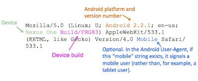
On the other hand, this User-Agent:
Mozilla/5.0 (Linux; U; Android 2.2.1; en-us; Nexus One Build/FRG83) AppleWebKit/533.1 (KHTML, like Gecko) Version/4.0 Mobile Safari/533.1contains “mobile” and “android,” so serve the web surfer on this Nexus One the mobile experience!
You’ll notice that Android User-Agents have commonalities:
While you may still want to detect “android” in the User-Agent to implement Android-specific features, such as touch-screen optimizations, our main message is: Should your mobile site depends on UA sniffing, please detect the strings “mobile” and “android,” rather than just “android,” in the User-Agent. This helps properly serve both your mobile and tablet visitors.
For questions, please join our Android community in their developer forum.


23 comments:
That's kind of a crappy way to detect, since iPad's also contain "Mobile" in their User Agent.
We need a way to distinguish tablets from phone devices using a single string for it to work well from an .htaccess perspective. Saying to create a hugely complex set of rules is a poor solution.
Why can't the device makers just standardize on some common strings? Save everybody all this trouble and reinventing of the wheel.
I look forward to seeing the Google Reader team apply this practice so that my Xoom goes to the full-sized version, rather than the phone-sized version. Better yet, how about a tablet-sized version!
Please remove that kind of stuff from your sites. I hate BEING FORCED to watch a mobile version of a site from the start and not having any choice at all.
I would rather prefer being asked if I wanted the full experience or a mobile one and then get served accordingly instead of being forcefed the mobile one.
@Otto
That would be why the article stresses "mobile" AND "android". The point being, if you just see "android", you serve the desktop version. Whereas if you see BOTH "android" and "mobile" you serve the "mobile" version. If you just have "mobile", well, it's not android is it? You serve something else in accordance with whatever companies guidelines on user-agents says.
Point taken though. Personally I think it would just be a lot easier if all browser user-agents standardised on something like: "width:1280; height:800; orientation:landscape;". There's no ambiguity there at all.
Personally I think it's a great idea!
As a web designer I prefer to concentrate on web design and let someone else worry about all the different user agents: http://blog.mobileesp.com
It has a whole bunch of different methods for determining which sort of device to serve up your content for.
Another solution would be using CSS Media Queries instead of stupid redirections to "iPhone versions". I'm bored of beeing redirected to the FRONTPAGE of the 320*480 pixels iPhone version of a website when i access a specific webpage with a high-end Android smartphone.
USE MEDIA QUERIES. Thank you :-)
Using the User-Agent string for this kind of thing seems wrong as we are relying on browser developers to implement something consistently to make sure that we're determining the correct device type.
Maybe a better idea would be if browsers could submit additional standardised header information to identify perhaps device type?
So in addition to the User-Agent string would could use a Device-Type string like this:
user-agent
Mozilla/5.0 (Windows NT 5.1; rv:2.0) Gecko/20100101 Firefox/4.0
device-type
mobile
After this point it would be better if instead of being forced to always use the full or mobile versions, the user could then choose which version to view and have the site remember this for future visits.
Or instead of sniffing the seemingly infinite array of possible user agents, try practising "responsive web design" (or just proper "web design")
http://www.alistapart.com/articles/responsive-web-design/
Here some good examples of it:
http://ribot.co.uk/
http://mediaqueri.es/
Click on those sites, resize your browser window, and watch the magic happen!
And if you absolutely have to serve up different versions of your site (most likely because it's more of a webapp) then do feature detection, not browser sniffing.
And what about Android phones with no "mobile" string in user agent ?
For instance, HTC Desire (also called Bravo) can have this user agent : "Dalvik/1.2.0 (Linux; U; Android 2.2; HTC Desire Build/FRF91)"
No "mobile" string, so we should redirect this device to the desktop website which is not adapted to the 3.7" screen...
fry15 is right. I'm now trying to make all my current and future designs work this way.
Be careful though... while this will work for the standard Android browser there will be problems with third party browsers like Opera and Firefox.
Firefox:
Mozilla/5.0 (Android; Linux armv7l; rv:2.1) Gecko/20110318 Firefox/4.0b13pre Fennec/4.0
Opera Mobile:
Opera/9.80 (Android 2.3.3; Linux; Opera Mobi/ADR-1103250857; U; en) Presto/2.7.81 Version/11.00
Personally, I prefer to use a mobile site on my Android tablet, even though I have a 10.1" screen with WSVGA resoultion.
Luckily for me, my tablet is running Froyo, and still says "Mobile" in the User-Agent.
Hey, recently many tablets (HCL, Reliance etc) in India are using Android 2.2 instead of 3.X as their OS. Will this trick work for them as well?
@Otto
I have to agree with Otto, this is a poorly thought out response.
Replacing the keyword 'Mobile' with 'Tablet' would surely be the simplest solution.
This explanation is completely bollocks .. I tried with LG Optimus One (which is obviously an android phone), this is its user agent:
mozilla/5.0 (linux; u; android 2.3.4; en-us; lg-p500 build/gingerbread) applewebkit/533.1 (khtml, like gecko) version/4.0 mobile safari/533.1
Then, I tried with Samsung Galaxy Tab 7 (which obviously a tablet), this is its user agent:
mozilla/5.0(linux;u;android 2.2;en-us;gt-p1000 build/froyo)applewebkit/533.1 (khtml.like gecko) version/4.0 mobile safari/533.1
Now, you tell me how to differentiate them in terms of user agent, as both have that 'mobile' word? =))
This is not to mention if android users decided to install a third party browser such as Opera Mini or such, they will generate different user agent =))
I think you should update your article, with more comprehensive way to differentiate between the two of them?
For anybody looking for how to actually detect I wrote a script in PHP that detects this correctly. It also detects iphone, blackberry, palm os, sidekicks, cricket phones, everything, and it's less than 1 KB!
Check it out: “Detect a mobile device with PHP in 547 bytes”
http://www.justindocanto.com/scripts/detect-a-mobile-device-in-php-using-detectmobiledevice
Does anyone know how I'd detect multiple parts of the User Agent in the .htaccess file?
I don't know how to either write a Regex that ANDs values and I don't know how to check for multiple values in a Rewrite Cond.
This probably doesn't work, but thinking something like this:
RewriteCond %{HTTP_USER_AGENT} android+Mobile [NC]
Thanks
I see a few people responding saying this doesn't catch Opera Mini, etc.
If you use this in PHP, it should catch all mobile devices:
function isMobile() {
return preg_match("/(android|avantgo|blackberry|bolt|boost|cricket|docomo|fone|hiptop|mini|mobi|palm|phone|pie|tablet|up\.browser|up\.link|webos|wos)/i", $_SERVER["HTTP_USER_AGENT"]);
}
There's more info here if you guys want: http://www.justindocanto.com/scripts/detect-a-user-on-a-mobile-browser-or-device
I'm working on a 2nd version that distinguishes between Tablets & All other mobile devices. I'll come back and post that when i get to it.
@justindocanto since June, i guess you could not find a way to detecet if it is a mobile or tablet for Android. The only way that i can see is to create a library of tablet models. It sounds ridicilous and not easy to update, i know.
As @inazrabuu said, there is no way to detect which one is mobile, and which one is tablet:
mozilla/5.0 (linux; u; android 2.3.4; en-us; lg-p500 build/gingerbread) applewebkit/533.1 (khtml, like gecko) version/4.0 mobile safari/533.1
mozilla/5.0(linux;u;android 2.2;en-us;gt-p1000 build/froyo)applewebkit/533.1 (khtml.like gecko) version/4.0 mobile safari/533.1
Second one is a tablet, not a mobile.
@Tolga Arıcan - I actually do have a solution, i just havent had time to launch it. It basically required making a list of all the tablets, then creating a clever preg_match to properly separate tablets & phones, as little code as possible. ill post it here when i have time to launch it =)
With iPad minis and the Samsung Galaxy Note, whether you are a tablet or phone is practically becoming meaningless or at least indistinguishable. Your device could be 1024px by 768px on an 19" monitor or the same pixels on a 3"x4" screen. Sizing the page based on resolution in these two cases produces drastically differently sized results. What pages really need to know is what is the PPI of the device (at zoom=1). This should be a standard property in all browsers' navigator object (and accurate). I don't know why something like this wasn't done years ago.
You may calculate (or better, sepparate) different PPIs based on window.devicePixelRatio (JS) or -webkit-min-device-pixel-ratio (CSS).
This, along with dimensions and UA detection results in a pretty accurate device type detection.
Post a Comment